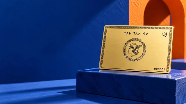
 TAP TAP GO

What the reader needs
Before styling a long article, write its headings as a plain outline. They should show the sequence of the explanation: the decision, available options, evidence, trade-offs and next action. Avoid using a large visual heading solely because a sentence sounds dramatic. W3C’s heading guidance supports a meaningful structure; your editorial task is to make that structure correspond to the questions a reader is actually trying to answer.
How to review it
Give the outline to someone who has not read the article and ask them where they would look for a specific answer. If they cannot tell, improve the headings before adding more navigation. Check that the page uses appropriate heading elements rather than merely bold text. Keep the structure sensible when sections are expanded, translated or reused. An accurate outline should remain useful on mobile and with assistive technology, not only in the desktop design screenshot.
Hypothetical example
A guide about partner evaluation originally uses headings such as “The future” and “Go further.” The editor replaces them with “What the partner provides,” “Evidence to request” and “Questions before signing.” The article keeps its visual personality while becoming easier to navigate.
Make it practical.
Use this checklist as you read. Checks are not stored.References & further reading
Further reading: W3C WAI: Headings ↗Published by Tap Tap Go. Product availability and eligibility vary by programme and market. About our stories.